Bar Chart Comparison
Bewertung:
4.6 / 5
Data Visualization
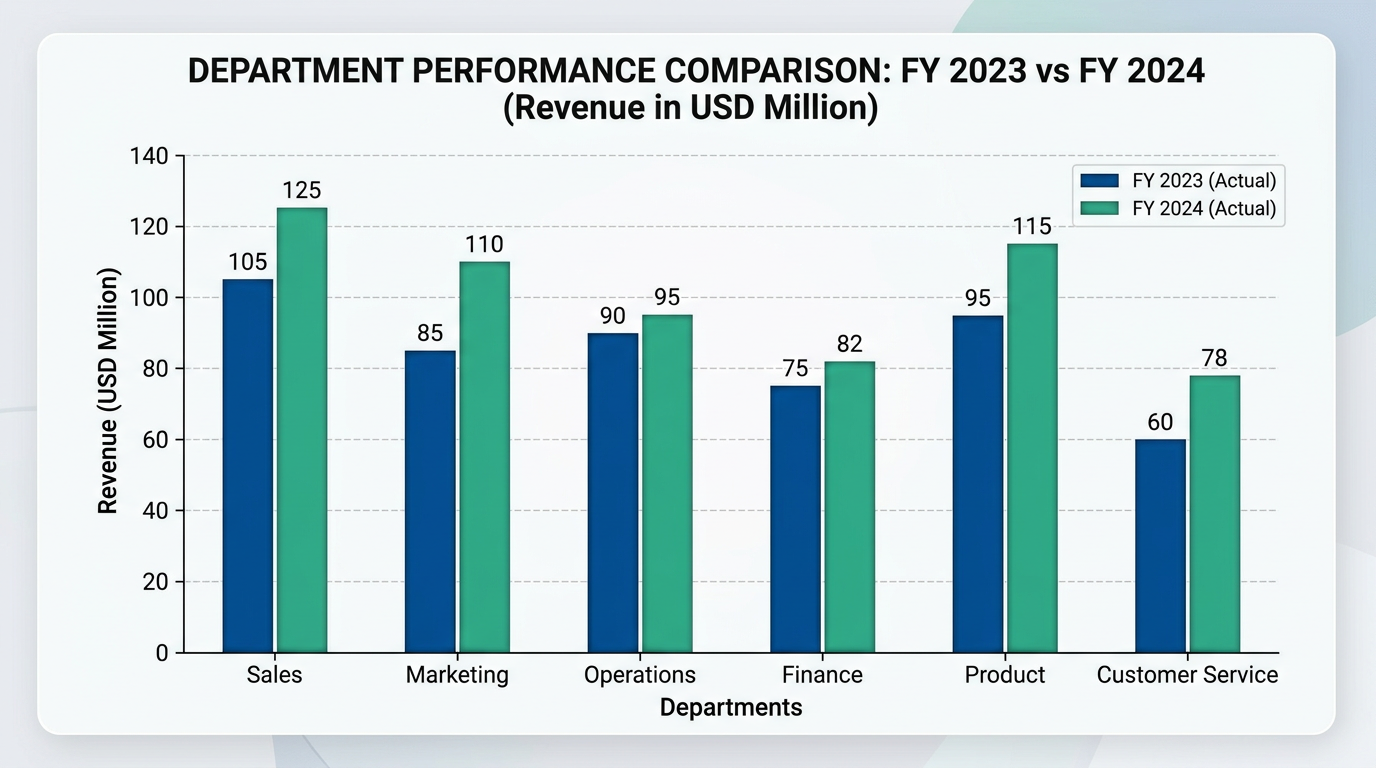
Beschreibung
Trying to visualize data and create charts? This nano banana prompt gives data analysts, researchers, and BI specialists an easy way to create AI images.
Prompt für nano banana 🍌
Create a professional bar chart for comparing data across categories. Chart type: either vertical or horizontal bars, 5-8 categories. Bars: grouped or stacked depending on data, use professional color scheme (different colors for categories or shades of same color). Include grid lines (subtle), axis labels, value labels on or above bars. X-axis: category names. Y-axis: numerical values with units. Title: clear and descriptive, at top. Legend: if using multiple data series. Design: clean business chart, clear data labels, professional typography. Style: corporate reporting, analytics presentation. 16:9 format.
Tipps
Use 'subtle grid lines' for reference | Include 'value labels' on bars | Request 'professional color scheme' | Specify 'clear axis labeling'