Pie Chart Donut
Wynik:
5.0 / 5
Data Visualization
Opis
If you're data analysts, researchers, and BI specialists and need to visualize data and create charts, this nano banana prompt is exactly what you need for AI image creation.
Prompt dla nano banana 🍌
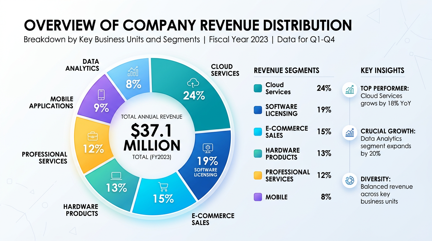
Create a professional donut chart infographic for data visualization. Chart: central donut showing 5-7 data segments with percentages. Center hole: total number or key metric. Color scheme: distinct colors for each segment (professional palette: blues, teals, with accent colors), subtle gradients or flat design. Legend: clear labels with segment names and values, positioned to right or below. Include title at top, subtitle with context. Design: clean modern style, clear segment separation (white borders), accessible colors. Optional: callout boxes for key insights. 16:9 or 1:1 format.
Wskazówki
Use 'distinct accessible colors' | Include 'clear legend with values' | Request 'white borders' between segments | Specify 'donut style' for modern look