Statistics Dashboard
分數:
4.3 / 5
Business Infographic
描述
Trying to create infographics and data visualizations? This nano banana prompt gives business folks, marketers, and analysts an easy way to create AI images. Professional results, minimal effort.
Nano Banana 提示詞 🍌
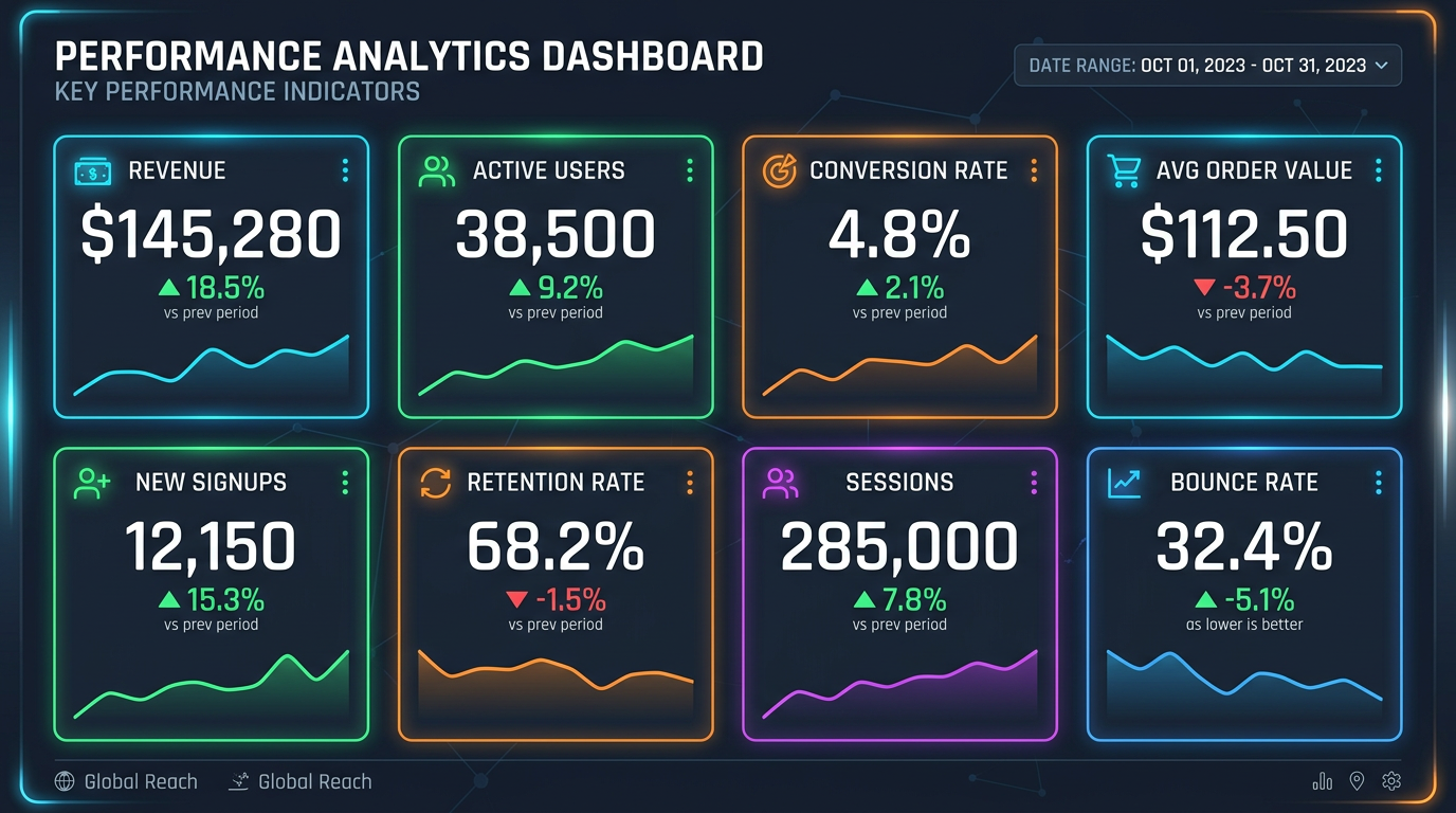
Design a statistics dashboard infographic showing 6-8 key performance indicators. Layout: grid of cards, each containing metric title, large number, percentage change (green up arrow for positive, red down arrow for negative), and mini sparkline chart. Top section: 3-4 primary KPIs in larger cards. Bottom section: secondary metrics in smaller cards. Color scheme: professional dark theme with neon accent colors (blue, green, orange, purple). Include date range filter indicator. Style: modern analytics dashboard, data-driven design, excellent number rendering. 16:9 ratio.
實用技巧
Use 'color-coded arrows' for trend indicators | Include 'sparkline charts' for historical context | Request 'large prominent numbers' for KPIs | Specify 'dark theme with neon accents' for modern look