Scatter Plot
Score:
4.5 / 5
Data Visualization
Describtion
Quick tip for data analysts, researchers, and BI specialists: use this nano banana prompt to visualize data and create charts with AI-generated images. Professional results, minimal effort.
Prompt for nano banana 🍌
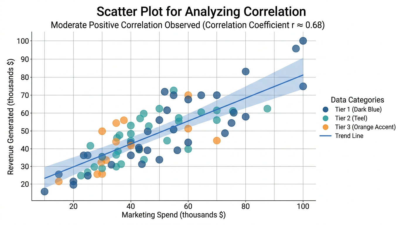
Create a professional scatter plot for showing correlation between two variables. Plot: 50-100 data points as circles, using color coding for categories or size for third variable. Include trend line if showing correlation. Axes: X and Y with clear labels and units, grid lines for reference. Legend: explaining colors or sizes. Title: descriptive at top, subtitle with correlation insight. Design: clean analytics style, semi-transparent points (70% opacity) to show density. Color scheme: professional palette (blues, teals, with accent colors). Style: scientific/business analysis, data exploration. 16:9 format.
Tips
Use 'semi-transparent points' for density visibility | Include 'trend line' if showing correlation | Request 'color coding' for categories | Specify 'clear axis labels with units'