Heatmap
Score:
5.0 / 5
Data Visualization
Describtion
Stuck on visualizing data and create charts? This nano banana prompt helps data analysts, researchers, and BI specialists generate AI images in minutes. Gets the job done fast.
Prompt for nano banana 🍌
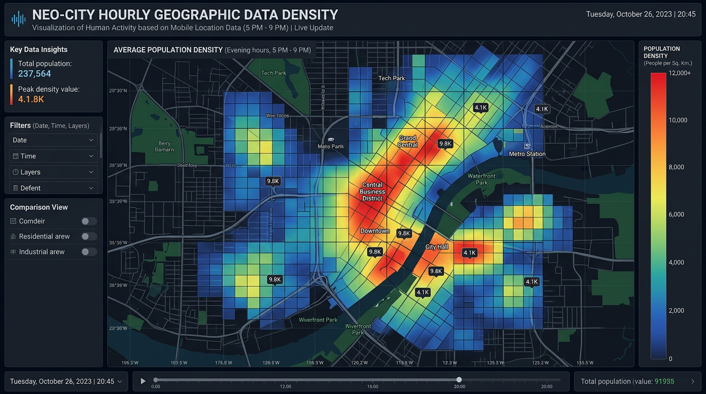
Create a professional heatmap for visualizing data density or intensity. Layout: grid or map-based depending on data type. Color scheme: gradient from light (low) to dark (high) or cold to warm colors (blue to green to yellow to red). Include legend/color bar explaining intensity scale. Labels: clear row and column headers or geographic labels. Title: descriptive at top. Design: modern data visualization, clear color differentiation, accessible palette (avoid red-green only). Style: analytics dashboard, geographic data, activity tracking. Format appropriate to data (square grid, geographic map, calendar). 16:9 or custom.
Tips
Use 'accessible color palette' (not just red-green) | Include 'clear color legend' | Request 'gradient from light to dark or cold to warm' | Specify 'appropriate format' for data type