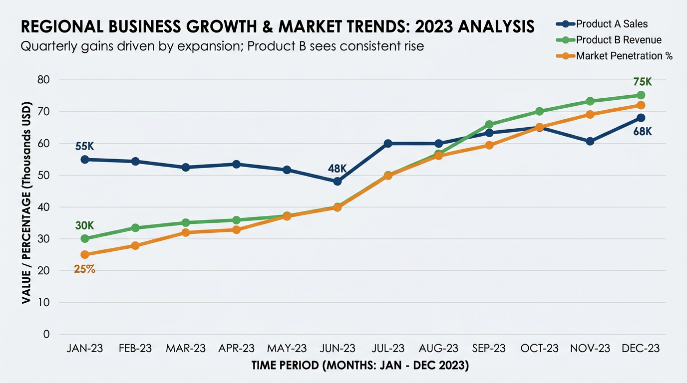
Line Graph Trend
Score:
4.6 / 5
Data Visualization
Describtion
Simplify visualizing data and create charts with this nano banana prompt - great for data analysts, researchers, and BI specialists needing AI-generated visuals. Saves time and looks pro.
Prompt for nano banana 🍌
Create a professional line graph showing trends over time. Chart: 2-4 data series as lines with different colors, showing data over 6-12 time periods. Lines: smooth curves or straight segments with clear data points (circles), thick enough for visibility. Include grid lines (horizontal mostly), axis labels, legend. X-axis: time periods (months, quarters, years). Y-axis: values with appropriate scale. Title: descriptive headline at top, possibly subtitle with key insight. Design: clean analytics style, contrasting colors for lines, clear markers. Style: business intelligence, trend analysis. 16:9 format.
Tips
Use 'contrasting colors' for multiple lines | Include 'clear data point markers' | Request 'horizontal grid lines' | Specify 'appropriate time scale'