How Color Grading Can Strengthen Brand Consistency Across SaaS Marketing Videos

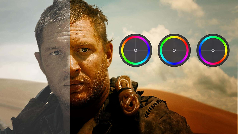
TL;DR: SaaS companies often create videos for product launches, ads, tutorials, social media, and customer education. Even when the content is strong, inconsistent colors can make the brand feel disconnected. Color grading helps teams create a shared visual language across different footage, creators, and campaigns. A clear color system, reference footage, and repeatable editing workflow can make videos feel more consistent without making every video look identical.
Introduction
Have you ever watched two videos from the same SaaS company and wondered if they came from different brands? The message may be similar, but the colors, contrast, skin tones, and overall mood can feel completely different.
This problem becomes harder as marketing teams publish more video content. Product demos, customer stories, social clips, webinars, paid ads, and launch videos may come from different cameras, editors, locations, or even AI-generated sources. Without a shared visual approach, the brand can slowly lose consistency.
Color grading can help solve part of this problem. It isn't just about making footage look cinematic. It can help teams create a repeatable visual style that connects different pieces of content.
For SaaS teams, that means deciding which colors should stand out, how warm or cool footage should feel, how much contrast to use, and how those choices should carry across campaigns.
This guide explains how color grading supports brand consistency, how to build a simple grading system, where AI-assisted editing can help, and what human editors should still control.
What does color grading do for brand consistency?
Color grading can give different videos a shared visual character by controlling elements such as color, contrast, brightness, saturation, and tone. When these choices follow consistent brand guidelines, videos created at different times can feel like parts of the same visual system.
Imagine a SaaS company that uses deep blue as a key brand color. Its product videos might use neutral backgrounds, slightly cool shadows, and controlled blue accents. A customer testimonial filmed in a warm office can still be adjusted to fit that visual direction.
The goal isn't to make every frame look the same. Instead, the goal is to create visual relationships between different types of content.
A useful grading system might define:
Preferred color temperature
Contrast level
Saturation range
Treatment of brand colors
Skin-tone priorities
Highlight and shadow behavior
Reference images or approved videos
Situations where a different look is allowed
This gives editors a shared starting point instead of asking them to interpret the brand visually from scratch.
Which parts of a video should you standardize?
The most useful elements to standardize are the ones that affect the overall visual feel without removing creative flexibility. For SaaS marketing, these often include exposure, white balance, contrast, saturation, skin tones, and the treatment of important brand colors.
Start with correction before grading
Color correction and color grading have different jobs. Correction brings footage toward a balanced state, while grading creates the creative look.
For example, footage shot under fluorescent lighting may have a green cast. That issue should be corrected before applying the brand's preferred look. Otherwise, the unwanted cast can become part of the final style.
The same principle matters when footage comes from different cameras. Matching exposure and white balance first gives the later grade a more reliable foundation.
Create a small visual rulebook
Your team doesn't need a 50-page document. A simple guide can be enough.
For example:
Brand video look
Neutral to slightly cool overall temperature
Moderate contrast
Natural skin tones
Controlled saturation
Blue used as an accent
Avoid heavily crushed shadows
Keep product interface colors accurate
This gives editors practical boundaries while leaving room for creative decisions.
How can you build a repeatable color grading workflow?
A repeatable workflow makes brand consistency easier because editors don't have to reinvent the process for every video. A practical sequence is to correct footage first, establish one approved look, apply it consistently, and then make shot-specific adjustments.
A simple workflow can look like this:
Review the footage: Identify differences in exposure, lighting, cameras, and locations.
Correct individual shots: Balance white balance, exposure, contrast, and obvious color casts.
Choose a reference: Select an approved frame or video that represents the brand look.
Build the grade: Adjust the reference shot until it matches the desired visual direction.
Apply the look: Carry the grade across related shots.
Fine-tune each clip: Adjust for lighting and subject differences.
Review the full sequence: Watch the video from beginning to end to catch distracting shifts.
Modern editing tools can also make this process more repeatable. For example, the invideo editor includes color wheels, curves, qualifiers, LUT controls, and scopes for manual adjustments. It can also use an editing agent to assist with color-related changes while keeping the result editable.
Why does consistency matter when footage comes from different sources?
SaaS teams rarely work with one type of footage. A single campaign might combine a screen recording, a founder interview, customer footage, stock clips, animation, and AI-generated scenes.
Each source can have a different visual character.
A customer may record a testimonial on a phone in a bright room. A marketing team may film a product demonstration with controlled lighting. A social media creator may send footage shot outdoors.
If these clips are placed together without correction, the viewer can notice the changes immediately.
A consistent grade can help reduce those visual jumps. The invideo editor can also let editors compare shots and carry adjustments from one clip to another, while still allowing individual refinements.
This becomes especially useful when marketing teams produce several versions of the same campaign.
For example, a product launch might need:
A 16:9 announcement video
A short vertical social clip
A customer testimonial
A paid advertising version
A product walkthrough
A sales enablement video
The footage and editing may change, but the visual language can remain connected.
Color grading for AI-assisted video workflows
AI-assisted video creation can increase the number of clips teams produce, but more footage also creates more opportunities for visual inconsistency.
Different generated clips can have variations in lighting, contrast, color temperature, and saturation. A repeatable grading process can help bring those clips closer together before they become part of the same sequence.
An AI-assisted workflow doesn't have to mean handing every creative decision to AI. In the invideo editor, users can give editing instructions, review the result on the timeline, and make manual adjustments when needed. Its current color workspace supports tools such as color wheels, tone curves, hue and saturation curves, LUTs, and scopes.
This can be useful when a team needs to make repeated changes across a large set of marketing videos.
For example, an editor could ask an AI editing agent to match the general look between two shots, then inspect the result and adjust individual clips manually. Invideo's documentation also recommends reviewing AI-assisted color work because footage, lighting, brand goals, and creative intent can change from shot to shot.
That balance matters. AI can reduce repetitive work, but human judgment still determines whether the final look supports the message.
Building a SaaS brand color system
A good color system should be simple enough for everyone on the team to follow.
Define primary and supporting colors
Start with the colors already used in your website, product, presentations, and other brand assets. Decide which colors should dominate and which should appear only as accents.
Set rules for real-world footage
Brand colors may look different in a real environment. Don't force every shot toward a specific hue if doing so makes people, products, or surroundings look unnatural.
Instead, define priorities. For example, skin tones should remain natural while a brand-colored object can receive more visual emphasis.
Use reference footage
A reference video can communicate the desired look faster than a page of descriptions. Keep a few approved examples that editors can compare against during production.
Test across different formats
A grade that looks good on a large desktop screen may feel different on a mobile display. Review important campaign videos across the devices and platforms where your audience will see them.
Common color grading mistakes to avoid
Consistency doesn't mean applying the same settings to every clip. Different lighting conditions often require different adjustments.
Watch for these common mistakes:
Grading before correcting: A creative look can exaggerate exposure or white-balance problems.
Overusing saturation: Strong colors can make footage feel artificial and distract from the message.
Crushing shadows: Very dark shadows can remove useful detail.
Ignoring skin tones: Brand colors should not come at the cost of natural-looking people.
Using one preset blindly: Identical settings can produce different results on different footage.
Changing the look between campaigns: Major shifts can make a brand's video library feel disconnected.
The invideo editor supports both AI-assisted changes and manual controls, so editors can use automation for repetitive work while retaining control over detailed adjustments.
Frequently Asked Questions
Is color grading the same as color correction?
No. Color correction focuses on making footage technically balanced, such as fixing exposure, white balance, or unwanted color casts. Color grading comes after that and shapes the creative appearance of the footage. In practice, editors often correct footage first and then apply a consistent creative look.
How does color grading help SaaS brands?
It can create a shared visual style across product videos, testimonials, social clips, ads, and other marketing content. When teams use consistent rules for contrast, saturation, temperature, and brand colors, videos made by different people can still feel connected.
Should every SaaS video use the same color grade?
Not necessarily. A consistent brand system should provide direction, not remove creativity. A product tutorial, customer story, and social campaign may need different treatments. The important part is that their visual choices still feel compatible with the broader brand identity.
Can AI help with color grading?
Yes. AI-assisted editing can help with tasks such as matching shots or applying requested visual changes. However, the result should still be reviewed by an editor. Footage can differ in lighting, exposure, skin tones, and creative intent, so automated changes may need manual refinement.
Can you use reference images for a color grade?
Some modern editing workflows allow editors to use a reference image to guide the desired look. In the invideo editor, users can provide a reference and ask the editing agent to guide color adjustments, then refine the result with manual controls.
What should a SaaS brand include in its color guide?
Keep it practical. Include preferred temperature, contrast, saturation, treatment of brand colors, skin-tone guidance, approved reference videos, and examples of looks to avoid. The guide should help an editor make decisions quickly rather than create unnecessary restrictions.
Conclusion
Strong SaaS video branding isn't only about logos, fonts, or opening animations. The overall color and tone of footage also shape how connected a video library feels.
A useful approach is to correct footage first, define a simple visual system, use reference material, and review every final sequence. This creates consistency without forcing every video into the exact same style.
AI-assisted editing can also reduce repetitive work, especially when teams manage many clips or campaign variations. The invideo editor combines AI-assisted workflows with manual color controls, giving teams a way to speed up routine edits while keeping creative decisions in human hands.
If you're building a larger SaaS video library, start by documenting one approved visual look and testing it across several formats.


