Seedream 5.0 Flash vs Lite vs Pro: We Ran a Productivity App's Visual Backlog Through All Three


Every software team that ships weekly also ships a steady stream of small pictures. A changelog post needs a thumbnail. A feature launch needs a square card for social media. The help centre needs a process diagram, onboarding needs four friendly illustrations, and the blog needs a header with room for a headline. None of these jobs is hard on its own, but together they form a backlog that usually lands on one overworked designer or gets skipped.
Image models are now good enough to clear much of that backlog, and the question has shifted from "can it do this?" to "which model, at which price, for which job?" ByteDance's Seedream 5.0 family makes that question concrete, because it comes in three tiers that share one API: Flash, sold as the fast, low-cost option; Lite, which goes up to 4K and can return a batch of related images in one request; and Pro, positioned as the quality-first model. Seedream 4.5, the previous generation, is still available too.
We wanted to know whether the more expensive tiers earn their price on everyday product-marketing work, so we ran one realistic backlog through all of them, with nine tests and 37 images. The whole exercise cost 69 cents.
The test scenario
We invented a company for this comparison: Fernpost, an AI meeting-notes and knowledge app with a small team and no full-time illustrator. Fernpost does not exist. Its brand uses three colours, deep teal #1F6F5C, warm yellow #F2B544 and an off-white #F7F3EA, and its marketing lead has a list of visuals due this sprint:
a blog header with empty space for a headline;
a square feature-announcement card with about 20 words of copy;
a five-step diagram for a help-centre article;
six thumbnails for the changelog;
four onboarding illustrations with the same character;
a social card edited after legal changes the wording;
a mock app screenshot for the website.
Each item became a test. Where a comparison made sense, we sent the identical prompt to several tiers. Where it did not, we used the tier a cost-conscious team would try first. We measured what can be measured: generation time, price per image, spelling, pixel dimensions, colour accuracy in ΔE2000 units, and the share of pixels an edit changed.
The three tiers on paper
Model | API name | Resolutions | Images per request | Price we paid per image |
Seedream 5.0 Flash | seedream-5-0-flash | 1K, 1.5K, 2K or exact pixels | 1 | $0.0123 |
Seedream 5.0 Lite | seedream-5-0-lite | 2K, 3K, 4K | 1 to 15 | $0.0252 |
Seedream 5.0 Pro | seedream-5-0-pro | 1K, 1.5K, 2K or exact pixels | 1 | $0.0263 at 1.5K |
Seedream 4.5 | seedream-4.5 | 2K, 4K | 1 (batches need references) | $0.0234 |
The prices are what each task reported after it finished. Flash is half the price of the others. Lite and Pro cost about the same per image, so the choice between them is about features and quality, not budget.
How we called the API
All four models use the same asynchronous pattern. You submit a task, receive a task ID, and poll until the image is ready. Switching tiers means changing one string, which is what makes a comparison like this cheap to run. Our helper looked like this:
import os, time, requests
BASE = os.environ["IMAGE_API_BASE"]          # your provider's /v1 endpoint
H = {"Authorization": f"Bearer {os.environ['IMAGE_API_KEY']}"}
def generate(model, prompt, **params):
    body = {"model": model, "prompt": prompt, **params}
    task_id = requests.post(f"{BASE}/images/generations", headers=H,
                            json=body, timeout=60).json()["data"][0]["task_id"]
    print("submitted", model, task_id)        # log it before polling
    while True:
        time.sleep(4)
        try:
            task = requests.get(f"{BASE}/tasks/{task_id}", headers=H,
                                timeout=60).json()["data"]
        except requests.RequestException:
            continue                          # retry the poll, never the submit
        if task["status"] in ("completed", "failed"):
            return task
for model, res in [("seedream-5-0-flash", "1.5K"), ("seedream-5-0-pro", "1.5K"),
                   ("seedream-5-0-lite", "2K"), ("seedream-4.5", "2K")]:
    t = generate(model, HEADER_PROMPT, size="16:9", resolution=res)
    print(model, t["actual_time"], t["cost"])
Two habits in that snippet are worth copying. First, write the task ID down before you start polling. If your connection drops while you wait, you can pick the task up again instead of submitting a second, billed request. Second, retry the polling call on network errors, but never blindly retry the submission. A submit that timed out may still have been accepted.
Test 1: the same blog header on four models
The first prompt was a typical editorial header, with a layout instruction that matters in practice: leave the left side empty so a headline can go there.
Editorial blog header illustration for a productivity software blog: a tidy
desk seen from above with an open laptop, a paper notebook, a mug of coffee
and sticky notes arranged in neat rows, flat vector illustration style with
and off-white #F7F3EA, generous empty space on the left for a headline,
no text, no logos
size 16:9 · Flash and Pro at 1.5K · Lite and 4.5 at 2K

Flash returned its image in 11 seconds, Lite in 33, Pro in 63 and Seedream 4.5 in 8. All four respected the palette and the flat style. The difference was in how well they followed the layout. Flash, Pro and Lite all kept the objects on the right and left roughly 40 percent of the frame clear, which is exactly what a headline needs. Seedream 4.5 drew a teal desk that runs edge to edge, with no clean space at all; you would have to crop or paint over it.
On craft, Pro produced the most "designed" result, with a pen, a handwritten page and layered paper shadows. Lite had the most convincing grain texture and arranged the sticky notes in actual rows, the detail we asked for. Flash was the plainest, with a centred laptop and a small stack of notes instead of rows, but it was perfectly usable as a header. If we had to pick one for publication, it would be Lite or Pro; if we needed ten variations to choose from, Flash would let us make them for the price of five.
Test 2: a feature card with 20 words of copy
Text inside images is where image models most often embarrass a brand. Our announcement card had a headline, three feature lines and a button, 20 words in all.
Square product announcement card for a notes app called Fernpost. Deep teal
background #1F6F5C. Large headline in bold white sans-serif: "Search every
meeting you forgot". Below it, three short lines, each with a small yellow
check icon: "Ask questions in plain English", "Jump to the exact minute",
"Works with Zoom, Meet and Teams". At the bottom a rounded yellow button that
says "Try it free". Clean modern SaaS marketing design, flat, plenty of
padding, no other text.
size 1:1

We checked each card with on-device text recognition and then by eye. The three 5.0 tiers spelled every word correctly, including the punctuation in "Zoom, Meet and Teams". Each still had a flaw worth knowing about:
Flash (11 s) added a "Fernpost" wordmark with a little leaf above the headline. We had mentioned the app name in the prompt but also said "no other text", so this is a small instruction-following slip, even if many teams would keep it.
Pro (48 s) set the button label in white on yellow, which is hard to read.
Lite (21 s) was correct and clean, with a high-contrast button. It was the only card we would post without any change.
Seedream 4.5 (9 s) wrote "Search every / every meeting / you forgot", repeating a word, dropped the check icon on the third line and placed the card inside a white frame we did not ask for.
For text-bearing marketing assets, this one test is a strong argument for the 5.0 generation over 4.5, and a mild argument for Lite as the default tier for anything with copy on it.
Test 3: a five-step help-centre diagram
Diagrams combine text, icons and structure, and the structure has to be right: five boxes, in order, with arrows. Our prompt asked for labels "Capture", "Transcribe", "Summarise", "Link" and "Recall", each with a smaller caption underneath, ten pieces of text in total.

All three tiers got all ten labels right, in the right order, and kept the British spelling "Summarise" that we used in the prompt rather than switching to American English. The layouts differed a lot:
Flash (13 s) drew large square tiles with detailed icons, a phone in a hand for "Capture", a microphone, a document, a chain link and a magnifier over a clock for "Recall". It filled the frame and would work at small sizes. The arrows were white on off-white and nearly disappear.
Pro (45 s) drew compact pill-shaped boxes in a single band across the middle and left more than half the canvas empty. Its arrows are so faint that the diagram reads as five buttons rather than a sequence.
Lite (116 s, the slowest single image in the whole test) drew clear dark arrows between boxes, which makes it the only one that truly reads as a process. The word "Summarise" sits tight against its icon.
For diagrams, none of the outputs was perfect, but Lite's was the only one we would publish as is. Flash's would need its arrows darkened. Pro's would need to be cropped.
Test 4: six changelog thumbnails at once
Changelog thumbnails are the definition of high-volume, low-stakes work, which is what Flash is sold for. We sent six prompts in parallel, one per feature, each asking for an icon and a two-word label in white on teal.
Small square changelog thumbnail for a notes app: a single flat icon
illustration representing {feature} centred on a deep teal #1F6F5C background,
with the words "{label}" in white bold sans-serif below the icon, minimal,
no other text.
features: dark mode, calendar sync, offline notes, shared folders,
voice memos, smart tags · model seedream-5-0-flash · size 1:1 · 1.5K
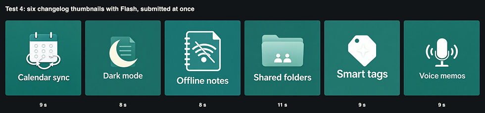
All six came back in 8 to 11 seconds of generation time, for 7.4 cents in total, and all six labels were spelled correctly. The icons matched their prompts, including a wifi symbol with a slash through it for "Offline notes" and a folder with two small figures for "Shared folders".
What Flash did not do was keep the series consistent. Label sizes vary visibly: "Smart tags" is set about a third larger than "Voice memos". The icons sit at different heights, and some use the yellow accent while others are pure white. That is the real limitation of generating a set as six independent requests: each image is internally fine, but they do not look designed as a family. Test 5 looks at two ways to fix that.
Test 5: four onboarding illustrations with the same character
Onboarding flows need several illustrations of the same person doing different things. We compared two approaches. The first was a single Lite request with n: 4, which switches on Lite's sequential mode and returns a related set. The second was the budget route: one Flash image as an anchor, then three more Flash requests that each passed the anchor as a reference image.
Lite, one request, n=4, size 4:3, 2K:
A set of four onboarding illustrations for a notes app, the same character
and the same flat vector style in every image: a young woman with short curly
hair, a mustard sweater and round glasses. Image 1: she is on a video call on
her laptop. Image 2: she reads a summary on her phone on a train. Image 3:
she drags a note into a folder on a large monitor. Image 4: she relaxes on a
sofa with a cup of tea while her phone shows a small notification. Palette
Flash, images 2 to 4, image_urls = [image 1]:
Onboarding illustration for a notes app: the woman from the reference image,
{scene}. Keep the same character (short curly hair, mustard sweater, round
glasses), the same flat vector style and the same palette as the reference
image ...

The Lite batch took 70 seconds and cost $0.10 for four images. The character is clearly the same person in all four: same hair, same glasses, and even a small detail we never asked for, a teal trim on the sweater's collar and cuffs, appears in every image. The framing is also consistent, a centred half-figure on an off-white background, so the four work as a carousel without adjustment.
The Flash route cost $0.049 for four images, less than half, and took about 25 seconds end to end (13 for the anchor, then three requests in parallel). Character consistency was good: the hair, glasses and mustard sweater carried over. Composition was less consistent, from a close-up on the train to a wide sofa scene, and the last image contained a mistake that would be embarrassing in production: the woman holds two teacups at once, one with a saucer and one without.
Our takeaway: when the images are meant to be seen together, Lite's batch mode is worth its price. It is the only tier that plans a set rather than making separate pictures. Flash with a reference image is a reasonable substitute for loose sets, provided someone checks every image for extra hands, cups and props.
Test 6: does resolution change the price?
We regenerated the Test 1 header with Flash at 1K and 2K and with Lite at 4K, and compared them with the 1.5K and 2K versions from Test 1. Because the Seedream 5.0 API takes the tier and the resolution as plain request parameters, a ladder like this is a few lines of code. Two findings matter for budgeting.

First, the price did not change. Flash cost $0.0123 at 1K (1312×736), 1.5K (2048×1152) and 2K (2560×1440). Lite cost $0.0252 at both 2K (2848×1600) and 4K (5504×3040). If you need a large file, there is no cost reason to ask for a small one. The 4K request took 44 seconds instead of 33, so you pay in time rather than money.
Second, more pixels did not always mean more detail. The 520-pixel crops above show the busiest part of each image. Flash at 1.5K drew a keyboard with readable QWERTY keycaps. Flash at 2K, with a different composition, drew a laptop with blank keys in an odd vertical layout. The 4K Lite image is genuinely high resolution, with the grain texture we asked for visible inside the coffee mug, but at that size a flat illustration contains a lot of empty paper. For web headers, 1.5K or 2K is plenty. Reserve 4K for print or for images you will crop heavily.
Test 7: editing copy after the fact
Marketing copy changes after the visual is approved. We sent the Flash and Pro cards from Test 2 back to their own models with an edit instruction, passing the original as a reference image:
Edit this card: change the headline to "Find any decision in seconds" and
change the button text to "Start free trial". Keep everything else exactly
the same: background, layout, the three lines of text, icons, fonts and
colours.
image_urls = [original card] · size 1:1 · 1.5K

Both edits were accurate: the new headline and button text were spelled correctly, and the three feature lines were untouched. To check that objectively, we compared each edited image with its original pixel by pixel. With Flash, 4.7 percent of pixels changed noticeably, and when we split the image into 20 horizontal bands, the changes were concentrated in the headline and button bands; the bands with the three feature lines changed by 2 percent or less. Pro was almost identical, at 5.2 percent. One subtle difference: Flash shifted the teal background slightly towards blue (from RGB 29/110/104 to 26/112/111 in the same corner), which you would notice only if the edited card sat next to the original. Pro kept the background closer. Both tiers also carried over their original faults: Pro's button is still white on yellow.
For copy changes, Flash does the same job as Pro in a seventh of the time and at under half the price.
Test 8: how close do brand colours come?
Brand teams care about exact colours. We asked for a deliberately simple composition, three circles in the brand's teal, yellow and a red accent #E4572E on the off-white background, and measured the median colour of each area in the CIE ΔE2000 metric. A ΔE under about 2 is hard to see; above 5, most people notice a difference side by side.

No tier matched every colour exactly, which is normal: diffusion models treat hex codes as strong hints, not instructions. Flash and Pro were close on the red and the background, and within a few units on the teal. Lite drifted most, with a teal that is noticeably darker and bluer (ΔE 8.0). Lite also misread the layout: it drew three nested circles, one inside the other, rather than overlapping ones. Pro placed its largest circle partly outside the frame.
The practical lesson does not depend on the tier. If a colour must be exact, for a logo, a product or a brand background, correct it in post-production or use the model for the illustration and lay the brand colour in as a flat layer. Do not expect a prompt to deliver a Pantone match.
Test 9: a fake app screenshot with eight exact titles
Product marketing often needs an illustrative screenshot before the real UI is ready. This is the hardest text test, because it mixes required text (eight note titles) with the small invented text every interface has: dates, menu items, placeholders.
Realistic desktop app screenshot of a notes application called Fernpost.
The left sidebar lists these eight note titles exactly: "Q3 planning sync",
"Hiring loop notes", "Customer call: Northwind", "Design review", "Weekly 1:1
with Sam", "Pricing experiment", "Bug triage", "Board prep". The main panel
shows the open note "Pricing experiment" with that heading and three bullet
points. Light theme, clean modern UI, readable text.
size 16:9 · Flash at 1.5K and 2K · Pro 1.5K · Lite 2K

All four screenshots contained all eight titles, spelled correctly and in order, 21 of 21 required words, including the colon in "Customer call: Northwind" and the "1:1" in "Weekly 1:1 with Sam". Each model also wrote three plausible bullet points for the open note on its own, for example "Test new tiered pricing with 20% higher value" and "Limit to 100 beta customers starting next week".
The difference was in the text we did not dictate. Flash at 1.5K added a second line of metadata under every title and garbled several of them: "Toolay", "2sterday", "Last wee", "2 weeksp". Those are exactly the errors that make a mock-up look fake when someone zooms in. The same Flash model at 2K, at the same price, produced a cleaner layout with no garbled text. Pro was clean but used very small type and invented specific dates ("May 30, 2025") that would date the screenshot. Lite used the largest, most legible type and numbered the notes, which looks less like a real app but reads well on a landing page.
If you use Flash for UI mock-ups, ask for 2K. It costs the same and, in our test, avoided the gibberish.
Speed and cost, side by side
Model | Images | Generation time (range) | Cost |
Seedream 5.0 Flash | 19 | 8–15 s | $0.234 |
Seedream 5.0 Lite | 10 (6 single + 1 batch of 4) | 21–116 s; 70 s for the batch | $0.252 |
Seedream 5.0 Pro | 6 | 45–69 s | $0.158 |
Seedream 4.5 | 2 | 8–9 s | $0.047 |
Total | 37 | $0.691 |
Times are the generation time each task reported, not including our own polling interval. We submitted most tests in parallel, so a few Lite and Pro times include queueing. Even so, the pattern is clear: Flash is consistently about four to six times faster than Pro and costs half as much. Lite is in between on speed and almost identical to Pro on price.
Which tier for which job
Backlog item | Our pick | Why |
Blog headers and hero art | Lite or Pro | Better composition and texture; Flash for drafts |
Cards with marketing copy | Lite | Only card with correct text, good contrast and nothing extra |
Process diagrams | Lite | Only one with clearly visible arrows |
Changelog thumbnails | Flash | Six correct labels in 11 seconds for 7 cents; fix consistency with a template |
Character sets | Lite with n > 1 | Plans the set as a whole; Flash plus a reference costs half but needs checking |
Copy edits on existing images | Flash | Same accuracy as Pro, 9 s instead of 64 s |
UI mock-ups | Flash at 2K or Lite | Flash 1.5K garbled small invented text |
Anything with exact brand colours | Any, then correct | No tier matched hex codes within ΔE 2 everywhere |
The surprise of the test was how rarely Pro was the clear winner. It produced the most refined illustration in Test 1 and the best background colour in Test 8, but it was the slowest tier and had a contrast problem on the card and an almost invisible set of arrows on the diagram. For a productivity team's everyday visuals, Lite and Flash covered almost everything.
Checklist for choosing a Seedream tier
Start every new prompt on Flash. At half the price and a quarter of the time, it is the cheapest way to find out whether a prompt works.
Move text-heavy assets to Lite. In our tests it was the most reliable tier for copy, contrast and diagrams.
Use Lite's batch mode for sets. One request with n above 1 produced a consistent four-image set; separate requests did not.
Ask for the largest size you need. Price did not change between 1K and 2K on Flash or between 2K and 4K on Lite.
Use Flash at 2K, not 1.5K, for UI mock-ups. It removed the garbled small text at no extra cost.
Edit instead of regenerating. Changing two lines of copy changed only about 5 percent of the pixels and kept the rest of the design.
Check every image for extra objects. Flash added a logo, a globe and a second teacup without being asked.
Correct brand colours afterwards. Hex codes in a prompt got within a few ΔE units, not an exact match.
The bottom line
For 69 cents and 37 images, the Seedream 5.0 family cleared a realistic sprint's worth of product visuals for a small software team. All three 5.0 tiers spelled every required word correctly in every test, which was not true of the older Seedream 4.5. The tiers differ less in raw quality than their names suggest, and more in speed, layout discipline and features: Flash is the fast, cheap workhorse for thumbnails, drafts and edits; Lite is the safest choice for anything with text, diagrams or a set of matching images; and Pro is best kept for the advanced editing work it was designed for. Whichever you choose, keep a human in the loop for colour, contrast and the odd extra teacup. If you want to compare these models with others on your own backlog, APIMart lists the full Seedream line-up alongside other image models under a single key.


