How To Fix Information Architecture Before It Buries You

Information architecture is the thing nobody thinks about until their own site turns on them. When it works, it is invisible, and people just find what they need. But sites never stay clean. You add a page here and a category there, and soon nobody can find anything. The worst part is, it costs you sales you never even see.
So let's sort it out before it gets ugly. We will show you 9 ways to untangle your information architecture. You will also get the mistakes that make it worse, plus how to keep what you know in one spot you can actually search.
What Is Information Architecture (IA) And How It Buries You?

Let's start plain. Information architecture focuses on how you organize and label everything so people find it. The textbook version splits it into 4 key components:
Organization: How information is structured
Labeling: How information is named
Navigation: How users navigate through it
Search: How people find specific information
The Warning Signs Your IA Is Starting To Bury You
The frustrating thing about bad information architecture is how slowly it creeps up on you. No single choice destroys it. It just grows crooked one page at a time, until nobody can find a thing. The good news is the warning signs are pretty easy to spot once you know them.
You will find a dumping-ground category called Misc or Other doing way too much work. You will see the same page in three different places. And you will watch people hit search for things that are one click off the homepage. That last one is the giveaway, since 68% of online shoppers won't come back after a bad search experience.
The funny thing is, a lot of this starts inside your own walls with your team's knowledge. When notes and docs are scattered everywhere, that disorder bleeds into what customers see. Getting your own stuff into one searchable place is where the fix starts. A tool like Remio pulls your loose files into one base you can just ask in plain English.
Warning Sign | What It Is Telling You | Which Fix Helps |
A "Misc" category people dig through | Your top groups don't match reality | Fixes 1 and 2 |
People search for homepage items | Your labels don't match their words | Fix 3 |
Endless clicks to reach a product | Your hierarchy is too deep | Fix 4 |
A huge category with no way to narrow | You need filters, not more pages | Fix 5 |
"Which one do I pick?" emails | Similar options aren't differentiated | Fix 6 |
The same page in several spots | Nothing gets pruned, only added | Fix 9 |
How To Fix Information Architecture: 9 Ways That Actually Work
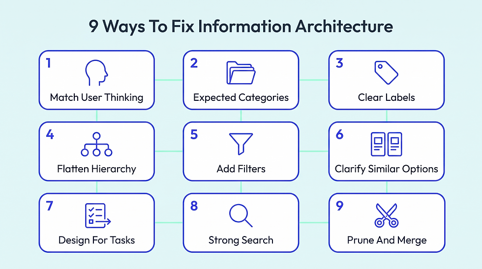
Alright, the actual fixes. Here are 9 ways to clean up your information architecture, each one aimed at a different way it breaks. Go in order, or skip straight to whichever matches the problem you are staring at right now.
1. Map How Users Actually Think, Not Your Internal Structure
Most disorganized information architecture comes from one habit. Companies build their site to mirror how they work inside. Departments become menu items. Internal nicknames become categories.
The trouble is, customers have no clue how you are set up. They arrive with their own idea of how things should group together, and a clash leaves them lost. You are trying to match the site's structure to their mental models, not your org chart.
There is a deeper reason this creates problems. Your internal setup is full of history and politics customers never see. A category might exist because one team fought for it, not because anyone shops that way.
Change it around and build for target users, and the whole site feels obvious to the people who matter. Simple information architecture diagrams can help you spot where your internal structure and the user's mental map diverge.
Run card sorting where users structure content into their own buckets
Interview 5 recent customers about where they first expected to find things
Read your site-search logs to see the exact words real visitors type
Name each category after a user goal, not an internal business goal. That does not mean ignoring business objectives; it means making them work alongside what users need
2. Group Things Into Multiple Classification Systems People Expect
Once you know how people think, you have to sort everything into groups that match. That starts with site mapping the paths people actually take, rather than the ones your teams assume they take.
This is the heart of information architecture, and where most sites fumble. They group by something that makes sense on a whiteboard but means nothing to a buyer. The classification scheme that works is built around the one difference that decides which option the user needs.
Group by the single attribute that changes which product someone actually needs
Keep every category mutually exclusive so no item clearly belongs in two
Limit top-level categories to a handful people can scan in one glance
Rename any category that needs a full sentence just to explain itself
This matters most when one product line splits into types for totally different situations. Picture a product that comes in a few versions for different setups. If a store buckets those by brand or model number, the shopper has to already know the terminology to find their match. Group by the situation they are in, and the choice makes itself.
Brondell does this cleanly for its range of water filtration systems. Instead of dumping every model into one list, it sorts them by how they install. If you rent and can't touch the plumbing under the sink, the countertop and faucet picks are sitting right there.
Half the catalog rules itself out in a second that way. Each group even shows the starting price and the certification, so budget and trust get settled before you click into anything. The thing to watch is overdoing it, and splitting into so many near-identical groups that people can't tell them apart. Brondell keeps the list short and backs it up with a comparison chart for the final call.
This logic holds anywhere one category serves wildly different needs, from home appliances to power mobile apps and digital products. Lead with the difference that drives the decision, and let a comparison sort out the rest.
3. Label Everything In Words People Actually Search
Grouping is only half the job. The label you add to each group decides whether anyone recognizes it. Teams fall in love with clever or on-brand names, but a clever label nobody understands is worse than a boring one that is dead clear. The labeling system has already lost if a visitor has to stop and guess what a menu word means.
And this pays off. One team increased first-click success from 52% to 78% just by rewriting its menu labels. Same pages and plainer words, and way more people got where they meant to.
Labels also go out of date on you. A name that was obvious 3 years ago slowly slips away from how people actually talk now. The words your customers use keep moving, and your main menu has to move with them, or it slowly stops matching.
Use the exact everyday nouns your target audience uses, not internal product names
Drop any clever or invented label that takes an extra second to decode
Test each label with a quick first-click test before you ship it
Match each menu label to the real words people type when doing user research
4. Flatten Deep Hierarchies So Nothing Hides Five Clicks Down
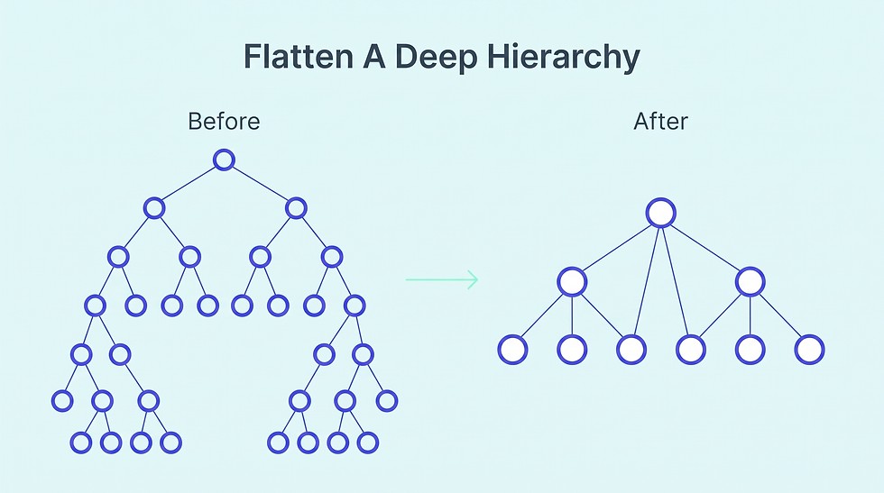
As a site grows, everyone's instinct is to add another layer. A category gets a subcategory. That gets its own subcategory, and soon the good stuff is 5 levels down. Depth isn't evil, but every layer is one more spot to take a wrong turn. Aim for the shortest sane path to anything that matters.
There is a ceiling on how much digging people will put up with. Every click is a small decision, and each wrong turn burns a little more patience. Shallow beats deep. Fewer forks just mean fewer ways to send someone down the wrong path.
Make sure every key page is reachable within 3 clicks from home
Show breadcrumbs on every page so people always know where they are
Collapse any subcategory that holds only one or two items into its parent
Add direct navigation links to your most popular pages from top-level menus. For secondary tools and account actions, utility navigation can keep those links available.
5. Add Filters And Facets To Tame A Big Catalog
At some point, no category tree can keep up with the volume. Once you have thousands of items, people won't click through folder after folder. They want to slice the whole set by the things they care about, in one move. That is what filters do, and on a big catalog they matter way more than the category tree.
Offer filters only for the attributes people truly decide on, like size
Show the search result count next to each filter option before people click
Block any filter combination that would leave someone on a zero-results page
Keep selected filters visible so people can remove them one by one
Filters become essential the second a catalog gets huge, especially where the right pick depends on compatibility. In niches stuffed with parts and models, nobody is browsing for fun. They know exactly what they need and want to get to it. A plain category tree makes them dig. Good filters let them jump straight to the match.
You can see this working on the Janome machines collection at SewingPartsOnline. On top of the brand page, it lets you filter by machine type and by price band. Shop By Type separates the basic mechanical machines from the computerized ones, so a beginner and a quilter never wade through each other's options.
Say you want a heavy-duty machine under a set budget. Two clicks and you are looking at a short, relevant list instead of a hundred models. The same brand logic runs through the parts too, so looking for a specific needle or foot stays just as quick.
This works for any deep catalog built on compatibility, like electronics or auto parts. Hand people the few filters that match how they actually choose, and never dump them on an empty page.
6. Make Near-Identical Options Easy To Tell Apart
Sometimes it is not about volume at all; it is about sameness. You have two or three options that look nearly identical, and the buyer can't tell which one is for them. That is where people hesitate, because picking the wrong one seems risky.
Strong information architecture doesn't just line these up. It drags the one real difference into the open. And a clear visual representation of those differences can make the choice even faster.
Place all of the similar options into one clean side-by-side comparison table
Lead each option with the single spec that actually sets it apart
Add a short plain-language note telling each person which option suits them
Answer the most obvious comparison question directly inside a short FAQ block
This gets really important where products share a name but differ on one spec that changes everything. Supplements are the obvious case. Two jars can hold the same herb and look identical, while one is several times stronger. If the page won't explain that, the buyer freezes or picks wrong and blames the brand.
These memory supplements from Nootropics Depot are a great example of doing it right. It brings together very different options, from Erinamax and Cognance Bacopa to OmegaTAU, Lion’s Mane, and Magtein, while explaining what each one is intended to support.
The page also gives shoppers some useful context around the ingredients and different mechanisms instead of leaving them to decode a list of product names. There are jump links to each one, so you are never scrolling around. And it tackles the exact question in everyone's head with a short FAQ. Nothing is left for you to guess.
This goes way past supplements, to any tiered product or software plan where the names blur together. Make the real difference the loudest thing on the page.
7. Design Around Tasks, Not Just Topics Or Data Architecture
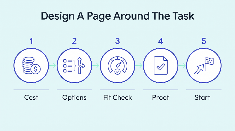
Not every page is there for browsing. Some exist to walk somebody through one job, like signing up or listing something. On those, a topic-style structure is the wrong fit. The page has to be built around the entry points, steps, and decisions of the task itself, so the next move is obvious, and nothing important is hidden.
This really counts when a page is helping someone through a big, one-time decision instead of a browse. High-stakes moves like selling an asset come loaded with uncertainty. The visitor doesn't want a catalog. They want to know what it costs and whether it is even right for them. Build the page around those questions, or you lose them.
The BusinessForSale selling process nails this. It doesn't hit you with a form. It opens with how much you save versus a broker, then lines up three plain packages side by side. They run from a free starter to a done-for-you concierge tier.
There is even a little calculator up top that shows the broker fee you are skipping, which answers the money question on the spot. After that, it gets blunt about whether selling privately suits you. Then it shows real seller stories, and only then hands you the button to list.
The same shape fits any high-stakes task. Order the page by the decision, not by your own list of features.
Map the real steps of the task before you design the page
Place the single primary action exactly where a visitor's eye goes first
Let visitors self-qualify early on so they quickly know the task fits
Remove any element on the page that does not move the task forward
8. Treat Search As The Safety Net For A Focused Navigation System
However tidy your structure is, a chunk of people will always skip it and go straight for search. When that user search comes up empty, you have lost them. A failed search is a dead end with no way back.
Search is your backstop for everything browsing misses, yet most sites treat it like a user interface feature that can run on its own. It deserves the same care as your menus. Your website navigation and search should work together, so users have another route when browsing fails.
And this isn't some small portion of people. Around 43% of shoppers head straight for the search bar, so a weak search system is failing almost half your visitors before they even start browsing. Give users a clear path without taking away useful alternatives – that is one of the core principles of focused navigation.
Keep the search box clearly visible and reachable from every single page
Use search that understands plain language and reliably forgives common user typos
Never return a blank dead page when a search finds zero results
Review failed searches each month to reveal missing content and bad labels
9. Prune And Merge Before You Add Anything New
Here's the real reason information architecture ends up buried. Teams only ever add. New pages and new categories keep coming, and nothing ever gets taken away. Every single addition makes the whole thing a bit heavier and a bit harder to move through.
Audit every page yearly and remove anything with no traffic or user flow
Merge thin pages that each cover only a sliver of one topic
Redirect every deleted page so its old links never break for visitors
Set a rule that every new section requires retiring an old one
4 Common Mistakes That Information Architects Make

Even with all 9 fixes, teams keep faceplanting on the same handful of mistakes. These 4 aren't about how you organize stuff. They are about how you run the work, and they slowly chew through good structure over time. The same information architecture principles still apply, but the way you manage them matters just as much.
1. Redesigning Everything At Once Instead Of In Slices
The itch to scrap it all and start over is strong, but a one-shot redesign is a gamble. You change every label and path at once. If findability drops, you can't tell which change did it. Plus, you retrain every existing user at once. Small structural design tweaks validated through usability testing beat one giant leap nearly every time.
2. Copying A Competitor's Structure Wholesale
It is tempting to lift the category structure straight from the biggest name in your space. The issue is their setup fits their catalog and customers, not yours. Their nav might be built for 10,000 products while you have 200. Steal ideas about clarity and naming, sure. Copying the whole tree usually drags in problems that were never yours.
3. Trusting Analytics To Tell You Why, Not Just Where
Analytics is brilliant at showing you where people bail. It is useless at telling you why. You will see a landing page with a high exit rate and assume the content stinks, when really the label that sent them there set the wrong expectation. Numbers point at the symptom. You still have to watch actual user behavior to find the real cause.
4. Letting Every Team Add Its Own Section
Information architecture rots fastest when nobody actually owns it. Marketing tacks on a landing zone and product tacks on a docs area, each with its own labels and logic. With no single person running the structure, the site splinters into disconnected pockets. Keeping it together means every new thing goes through one shared, organized space with rules everyone agrees on.
Conclusion
Honestly, the biggest thing to remember is that information architecture is never actually finished. In today’s digital landscape, the web sites that stay easy to use keep pruning and testing while everyone else just keeps adding. You don't have to fix all 9 of these this week. Pick your worst symptom and sort that one out. You will feel how much lighter everything gets.
This is exactly the problem we chip away at over at Remio. Bad structure usually starts with your own scattered info, so we built an AI workspace that pulls your files and notes into one private base you can just ask. Get your own stuff organized first, and good information architecture gets easier. Get in touch with us now.


