Treemap
Score:
4.9 / 5
Data Visualization
Describtion
No more struggling with visualizing data and create charts - this nano banana prompt helps data analysts, researchers, and BI specialists generate AI images effortlessly.
Prompt for nano banana 🍌
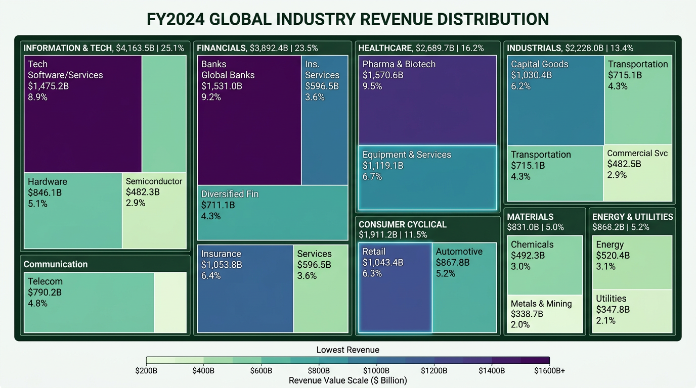
Create a professional treemap for visualizing hierarchical data as nested rectangles. Layout: large rectangle divided into smaller rectangles, size proportional to values. Each rectangle: label (category name), value, percentage of total. Color coding: different colors for categories or heat map coloring by value metric. Include legend explaining color coding. Labels should be sized appropriately for rectangle space. Title: descriptive of data being shown. Design: clean data visualization, clear size differentiation, business analytics style. Use for market share, portfolio allocation, budget breakdown. 16:9 or square format.
Tips
Use 'size-proportional rectangles' | Include 'color coding by category or value' | Request 'clear labels' sized for space | Specify 'legend for color explanation'